How graphs can help you find information in data
If you think graphs and networks techniques are only useful for graph datasets or data structured as a network of entities, you are wrong. You can leverage powerful graph methods by designing a graph from unstructured data. In this example, I show how to extract information from a set of texts (emails). At the end of this post, you will discover what H. Clinton was talking about in her emails, on which topics she was exchanging information and who/what was involved in each topic.
As a teaser, I can’t resist to show you an image of Clinton’s emails universe:
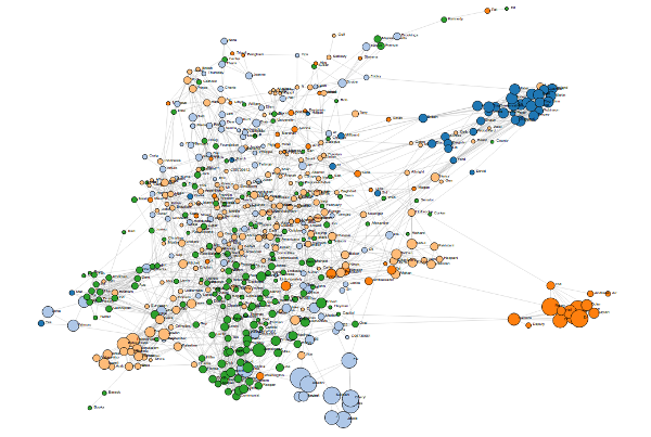 This is an example of a visualization of a network of words. A look at the graph provides interesting insights into this dataset of emails. Topics discussed in the emails can be guessed from the figure and the labels, as you will see below.
The nice post of my colleague and friend Volodymir on Wikipedia graph mining, made me think that I should blog as well on my exploration of graphs and data analysis. Blogging is an interesting way to spread some science to a broader audience and scientists should do that more often. Also, this could help me share the fascinating world of graphs and networks and how it can be useful in practice. So here is my first contribution.
The data
The goal of this post is to demonstrate with an example that one can build a graph from some unstructured dataset to extract valuable information. Our dataset will be a set of texts. I have chosen Hillary Clinton’s emails as they are publicly available, most of the world has been aware of this controversy, or can easily get some information about it on wikipedia. We can find the dataset on Kaggle here. This dataset contains the emails sent and received by Hillary Clinton between 2009 and 2011 in her private mailbox. As I said, the data has been made freely accessible to the public, except for some parts which have been censored by the US government. There are 7945 emails.
The graph
The code for the data processing and graph design is available on my Github account.
The idea is to extract some keywords from the emails and see how they relate together. From this, we could infer some interesting stories about politics and the work of H. C.
Nodes
We want to find some important words in the texts, and get rid of the useless articles for example. We could use a Natural Language Processing toolbox, there are several in Python. However, I want to keep this example simple. So we will select the proper nouns in the texts which can be found easily because they begin with a capital letter. Unfortunately, not all words beginning with a capital letter are proper nouns. The first word of each sentence has a capital as well. To avoid useless keywords, we can get rid of the words that appear frequently both with or without a capital letter. It is a sign that they are not proper nouns. This selection process is not perfect but it is a compromise between accuracy and complexity.
The keywords that have just been extracted from the corpus will form the nodes of our graph.
Edges
Let us connect the nodes together if the keywords associated can be found in the same email. Moreover, we will associate a weight to the link, proportional to the number of texts where we have found them together. We expect to find clusters of well-connected words, forming topics.
But this is not enough to make a nice insightful graph to visualize. If you are someone experienced with data analysis you may think that this seems too good to be true. You are right. There are too many edges in the graph and it requires a bit more processing. So some (in fact, many) edges have been removed based on their weight and the degree of the nodes they connect. We remove the weakest links, but weakness is relative to the node degree: We require that links have more chances to be removed if they connect nodes with numerous connections.
The Visualization and analysis
In order to separate nodes into groups or clusters, a community detection algorithm has been applied to the graph. On the figure, each color represents a different community. In addition, the radius of each node is related to the number of occurrences of the word in the texts. The layout of the graph is a force directed layout, meaning that nodes repulse each other and links are some elastic bindings between them.
The interactive graph can be found by clicking on the following link: Interactive visualization.
Since it is hard to explain on an interactive visualization, I have made some screen shots of the graph. The following figure shows a global view of the graph.

On the borders of the graph, we can see several groups of nodes, many of them having a large radius (appearing in many emails). Notice that the visual clusters are not the same as the clusters found by the community detection. This is not a problem and both clusterings can bring slightly different information.
A closer look at the node colors shows that the communities are related to particular topics:
- Foreign affairs (light orange)
- US politics (Green)
- United Kingdom (dark blue)
- Clinton’s collaborators (light blue)
- Travel/meetings (dark orange)
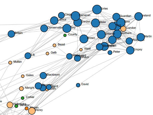
As expected, H. Clinton messages are mainly focused on US politics and foreign affairs. First interesting fact is that she seems to treat UK politics differently from the rest of the world. Indeed, UK politics has its own cluster quite well separated from the rest. You can see Brown and Cameron in good position inside this group.
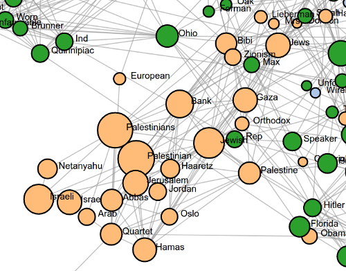
Staying in the foreign affairs, a large cluster can be seen containing words related to the Middle East, Israel and Palestine; A major concern of US politics for years. The size of the nodes shows how busy H. Clinton was writing emails about these topics. If you over the mouse on the nodes in the interactive visualization, you can get the number of occurrences of the words. Palestinian (244 times), Israeli (143) and Jewish (156) are the most used words in this cluster.
You can also spot in the middle of the graph a group of nodes related to Taliban, Afghanistan and Pakistan. This group is not as clearly isolated as the Middle East one. This might be due solely to the visualization layout or maybe because the emails concerning this topics are less focused and involve different other nouns/countries.
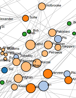
Back in 2010-2011, there was a major concern about the Middle East and Muslim countries. This is still true today.
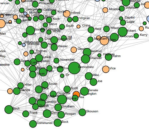
Concerning the US politics, there is a large cluster with various keywords at the bottom of the graph. The precise topic is unsure and could involve several themes. Further analysis of the emails should be done to understand how they relate. The word “Democratic” seems to be quite central.
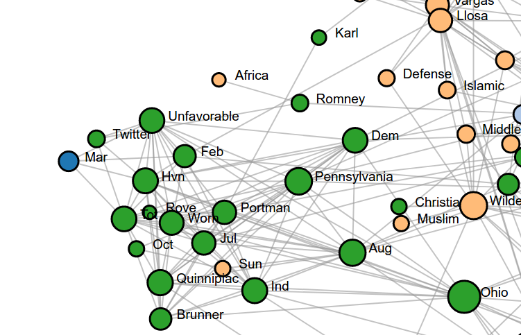
During her mandate, it seems that one of the US elections has particularly raised H. Clinton interest. If you google some of the keywords in the image below, you will find this page relating the event. The Democrat Brunner lost the Senate election in Ohio and the Republican Portman was elected.
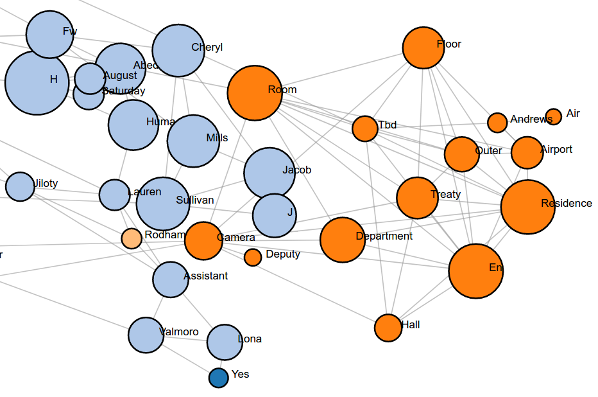
Eventually, it is interesting to note that H. C. has close collaborators with whom she exchanges often. They are visible as light blue nodes on the following image. The orange nodes next to them seem to be related to the places, travels, and meetings Hillary refers in her emails.
Some themes are clear and well-separated, some other not. For example, if you drag a node with a country name (mostly in light orange), You can see connections with other countries. You may notice a subgroup of South American countries, one with Asian countries and one related to Europe but connections between the groups are also present. These connections are of course not surprising and show a glimpse of the complexity of international relationships.
Conclusion
This Graph of words gives a snapshot of the topics discussed in Clinton’s emails. It is a quick way to get information without having to read the 7945 emails. It delivers much more information than just a list of keywords appearing often in emails. Remember that the raw data (texts) were not structured. Giving some structure with the aid of graphs led us to an interesting tour of Clinton’s political work. I hope I convinced you that graphs are useful tools for data mining, even if there is no network in the data!
Concerning the improvement of the visualization, we can point out a few uninformative nodes. The visualization could be improved further with an additional cleaning of the dataset. For example, first and last names should be put together because the node “Robert” connects here all the persons with first name Robert even if they are completely unrelated. Words containing numbers or nodes with month names should also be removed.
Further development could be done by taking the time into account. Clearly, some of the topics have a limited time span and related keywords that do not appear in this time span could be easily disconnected.
