Exploring the oceans, around Antartica
The Antartic Curcumnavigation Expedition is a scientific expedition that has collected a large amount of data from Antartica. Scientists working on the project would be happy to get some help from experts in data analysis and data scientists. They plan to make the data open and during the first Data Jam at EPFL in Lausanne, some of their data were presented. The goal and the dataset convinced me to join them in the analysis of the sonar data. This post is a short presentation of what we managed to do during the 2 Data Jam Days. It reveals some interesting information about Antartica and on the methods used to analyze sonar signals.
Context
Recently, I had the opportunity to participate in the first “Data Jam Days” that took place at EPFL in Lausanne, Switzerland. The concept is to invite people of various backgrounds in one place during two days and let them work together on some nice datasets. It was a cool experience and I look forward to the next one.
For the two days, I teamed up with Camille Le Guen, the ACE expert who presented us one of the datasets. She is doing her PhD and has spent several weeks on a ship around Antartica. She has many fun stories about her experience on the ship, camping on some of the Islands or catching penguins, putting GPS trackers to find out where they find their food.

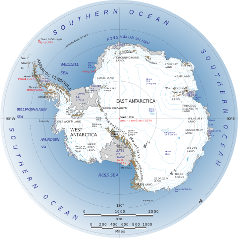
Antartica is the large continent around the South Pole. It is a part of the earth which is still largely unknown. Yet it has a rich ecosystem, in particular in the oceans around it. Birds, mammals, fishes, Krill, plankton are everywhere. I found it really interesting and motivating to work on data from this continent.
The code written during the workshop is available on Github. The data should be available soon.
The dataset
Several datasets were presented and I chose to work on the one from the Antartic Circumnavigation Expedition. This is one of the 22 scientific experiments done during the expedition. Sonar signals were collected continuously while the ship was traveling around Antartica. The purpose was to extract echoes in the data that are due to krill swarms (mainly but can also be due to other living organisms). The swarms reflect the acoustic waves and this is detected by the sonar. Unfortunately, these reflections are weak and it is difficult to distinguish them from the noise and the other sonar artifacts.
.jpg)
Let us look at a plot of the sonar data. On the image below, we can see the ocean depth on the y-axis. The top is just below the surface, where the sonar emitter is located. The bottom is here at around 30m below the surface. We decided to focus on this region as it is where the krill swarms are supposed to be, and where the signal is of better quality. The x-axis represents the time. The sonar emits a ping every 8 seconds, so each value is a 8 seconds time frame. As the ship is moving you can also see the x-axis as a distance. For each point, the color represents the amplitude of the sonar echo (in a log scale). It ranges from blue and green for small values to yellow for strong echoes.

At the surface, the signal is very strong (thin yellow line) due to reflections and noise from the ship. After going down a few meters, the signal intensity reduces and the image turns greenish. If you look carefully, you may see shades of green and blue forming patterns, that is where the krill swarms are. It is not so easy to spot!
Each ping of the sonar is tagged with its GPS coordinates and the time. Hence we can find the precise location of a krill swarm when we have detected one.
Our goal
Two days is very short and it is difficult to ask for ambitious results. After a few minutes of brainstorming and a coffee, we settled on a roadmap. We wanted to have at the end an image of the earth and some ticks where krill swarms were detected. If we had time we could add information on each swarm, like its width and depth and play with color and size of the ticks.
We fixed several milestones:
- Detect the presence of krill in the data
- Extract its information
- Create a map to visualize the results
Signal processing and denoising
The main task for us was to extract the krill swarm signature from the noise. And indeed, the data was terribly noisy. Usually, in data science, you have cleaner datasets. It was a great challenge but I was confident. I have spent several years in the past, working on acoustic and radar signals as well as denoising techniques.
Fortunately for us, there is a great Python module called scikit-image or skimage that helped us to quickly apply different denoising techniques and see what would give the best outcome.
In the dataset, there are particular noise patterns forming straight vertical lines. We used a hand-made variant of the median filter from Roland Proud, a former postdoc working on sonar data. In order to remove isolated high values appearing in the data, often called salt-and-pepper noise, we used a median filter. We took medfilt from Scipy.
After some trial and errors, we found out that the relevant signal values range from -70 to -65 while the full range is from around -100 (even less) to around 10 for the most powerful echoes and artifacts. Reducing to the former range gave us a better view of the potential krill swarms.
Eventually, we suppressed the remaining noise by applying the skimage Gaussian filter.
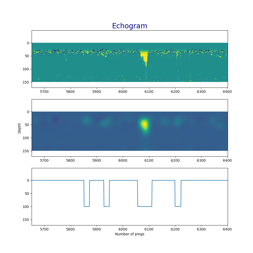
After the denoising, we summed up the echo values along the depth axis and got a binary “krill presence function” that took a positive value if there was some krill detected during a ping.

On the above figure, the top plot is the raw signal where the highest values have been decreased (in particular near the surface). Do not pay attention to the scales, this is a number of points. You may convert to meters if you multiply by 0.2 the y-axis values and in seconds if you multiply by 8 the x-axis values. The middle image shows the result of the Gaussian filter that smooths out most of the noise. The krill signals become smooth bumps. The bottom function is the detection function which has value zero in the absence of krill and take the value 100 when krill is detected.
The denoising and detection part took us the entire first day and half of the second day. We were glad to get such a nice “krill detector” after all the time and effort spent on it. Of course, the signal processing is not optimal. I am sure we got several false positives and false negatives. The denoising is crude but we can refine it in the future.
Data visualization
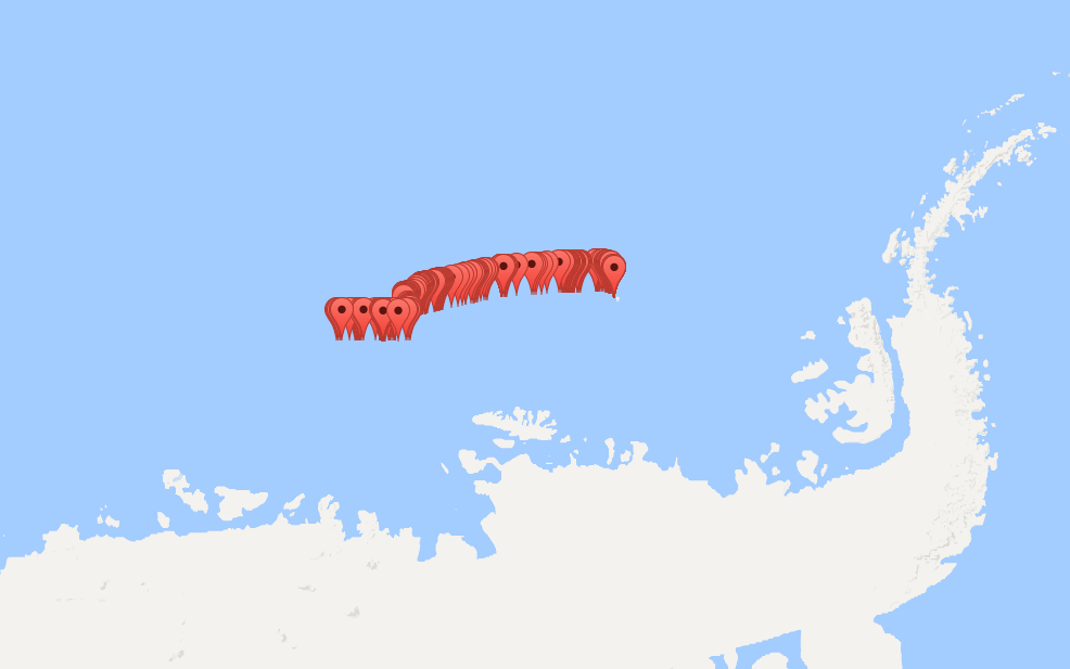
During the last hours of the workshop, Quentin came to us and offered to help us. He is an expert in web applications and that was perfect for us as we were in need of a good visualization. We wanted a map of the location of the krill swarms. He suggested to use the Google map API and asked us for a json file with the latitude and longitude of our swarms. He prepared a quick web page where we could put the json file and get the visualization. Here is the result.

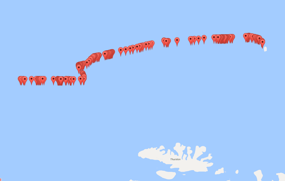
We studied 2 consecutive days of sonar data (14th and 15th of February 2017). The marks on the map correspond to krill swarms detected along the path of the ship during these 2 days. You might be surprised by the number of swarms but it is not unusual. In this region the ice melt and the presence of warm and cold water create good conditions for the krill to multiply. A zoom on the area (below) shows the irregular distribution of krill.

Conclusion
I was really happy with the outcome of these data jam days. I enjoyed coding in Python and using image and signal processing methods to extract meaningful information. The results exceeded our expectations. Of course, there is still some work to be done before reaching conclusions of scientific value: the false positive and false negative rate must be assessed.
We made a great team with complementary skills: the combination of an expert in the data on one hand and an expert in signal processing on the other hand. We had a lot of discussions and exchanges about the data, the kind of pattern to look for, where to look for it, what is meaningful what is not. I felt useful and happy to make a small contribution to a better understanding of Antartica.
